
Fitbit Enterprise Health Dashboard
Improving population health at scale
Overview
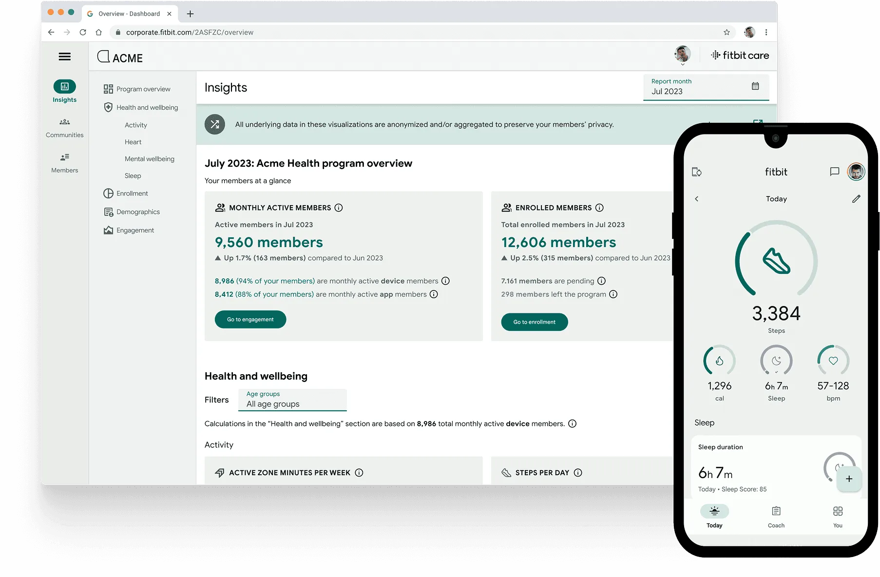
I led the design of Fitbit’s new enterprise flagship product, built for health administrators at insurance companies, health plans, and employer groups to monitor, benchmark, and improve member health over time. As design lead, I supervised another designer and collaborated closely with a five-person mobile team.
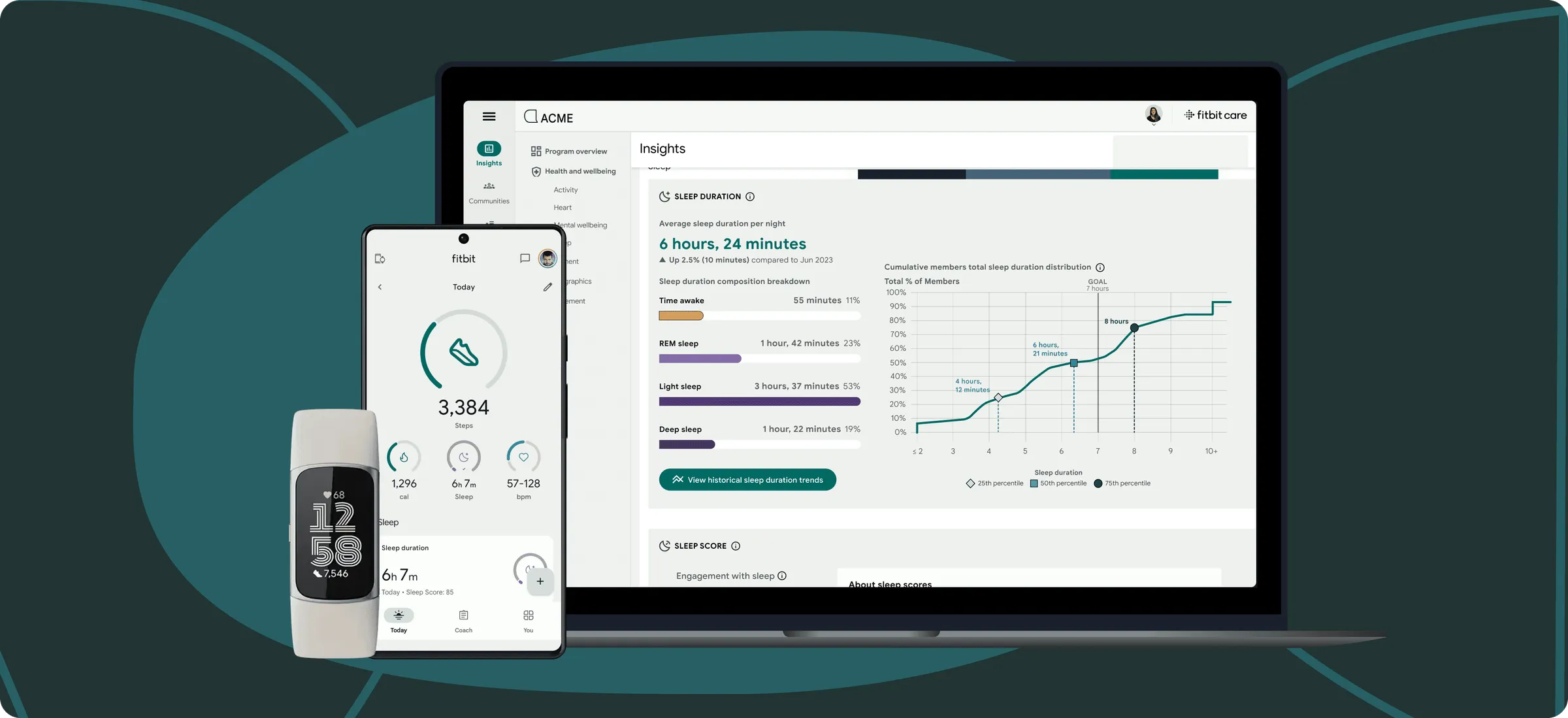
We successfully launched our refreshed platform 7 months later to over 275 companies, representing 35,000+ Fitbit users. This launch was well received by the press.
Context: About Fitbit Care
Fitbit is known for their consumer products, such as their fitness and sleep trackers, and corresponding mobile app. However, they have a profitable enterprise business that is not recognized outside of the healthcare industry.
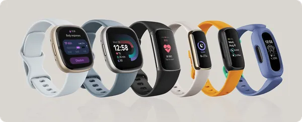
When I joined Fitbit at the end of 2022, the company was still in the midst of a brand refresh following its acquisition by Google in early 2021. I came on board to support efforts to expand the business into the Medicare Advantage space, with a focus on older adults, aged 65+.
Challenge: An Unexpected Blip
As a team, we were given 6 months to design, build, and launch an MVP that would successfully migrate users off the existing dashboard and allow us to deprecate the legacy experience.
However, in early 2023, a few months after I joined the team, Google laid off 12,000 employees, including my entire engineering team, with a short timeline to transition roles.
To support the team through low morale and limited resources, I jumped back into front-end development and helped launch this experience 7 months later. I leaned into engineering to accelerate delivery and navigate Fitbit’s complex codebase during a critical period.
Design: Data Visualization Accessibility
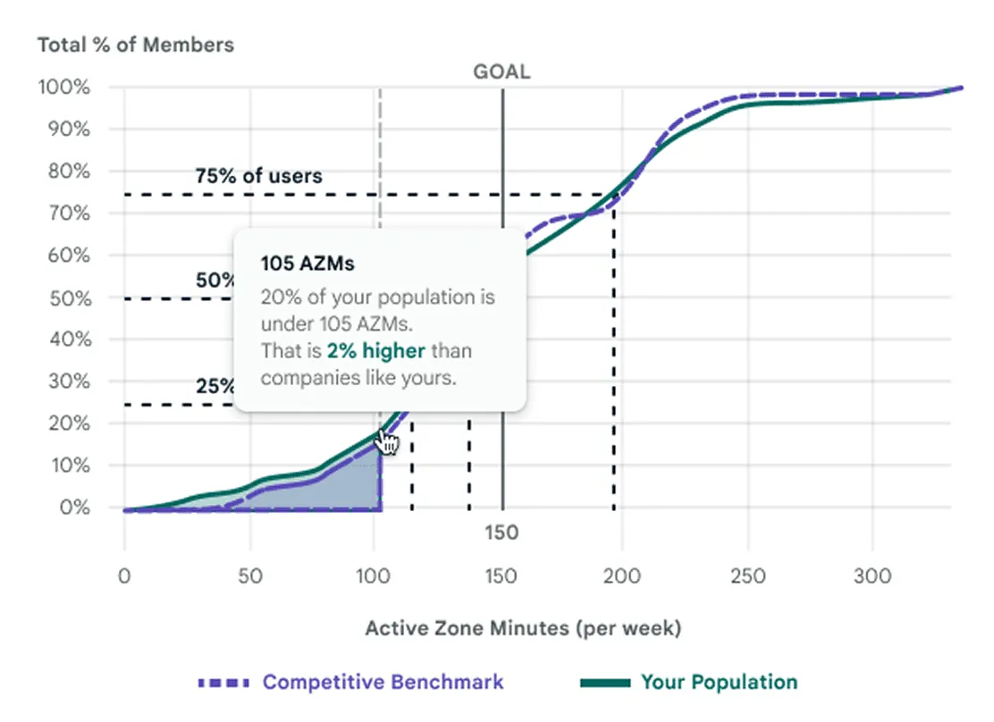
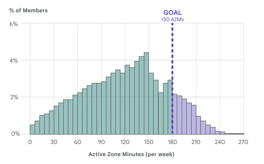
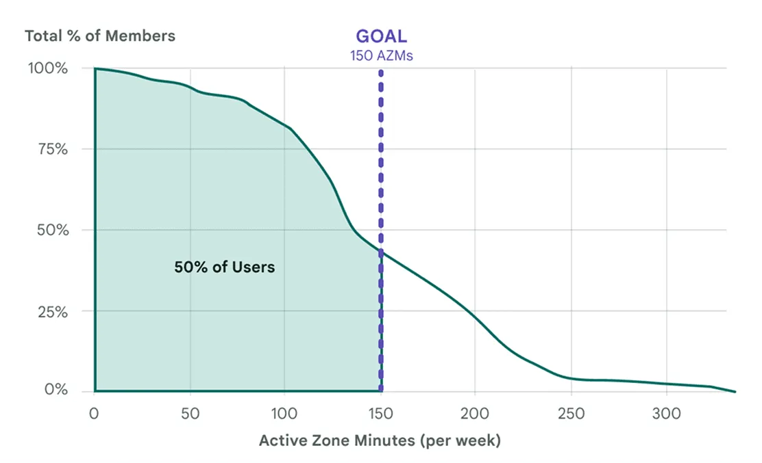
Knowing we were building a data-heavy dashboard, I partnered closely with Engineering to evaluate various charting libraries that balanced flexibility and accessibility. We ultimately chose Highcharts for its robust accessibility support.
To ensure our visualizations were intuitive and inclusive, I:
- Joined Google’s Data Accessibility Working Group to deepen best practices
- Partnered with our data scientist to identify the most effective visual representations
- Collaborated closely with engineers to design and implement accessible, easy-to-understand charts
- Ran usability testing with subject matter experts to validate comprehension and clarity
Design: Crafting a Consistent Design Language
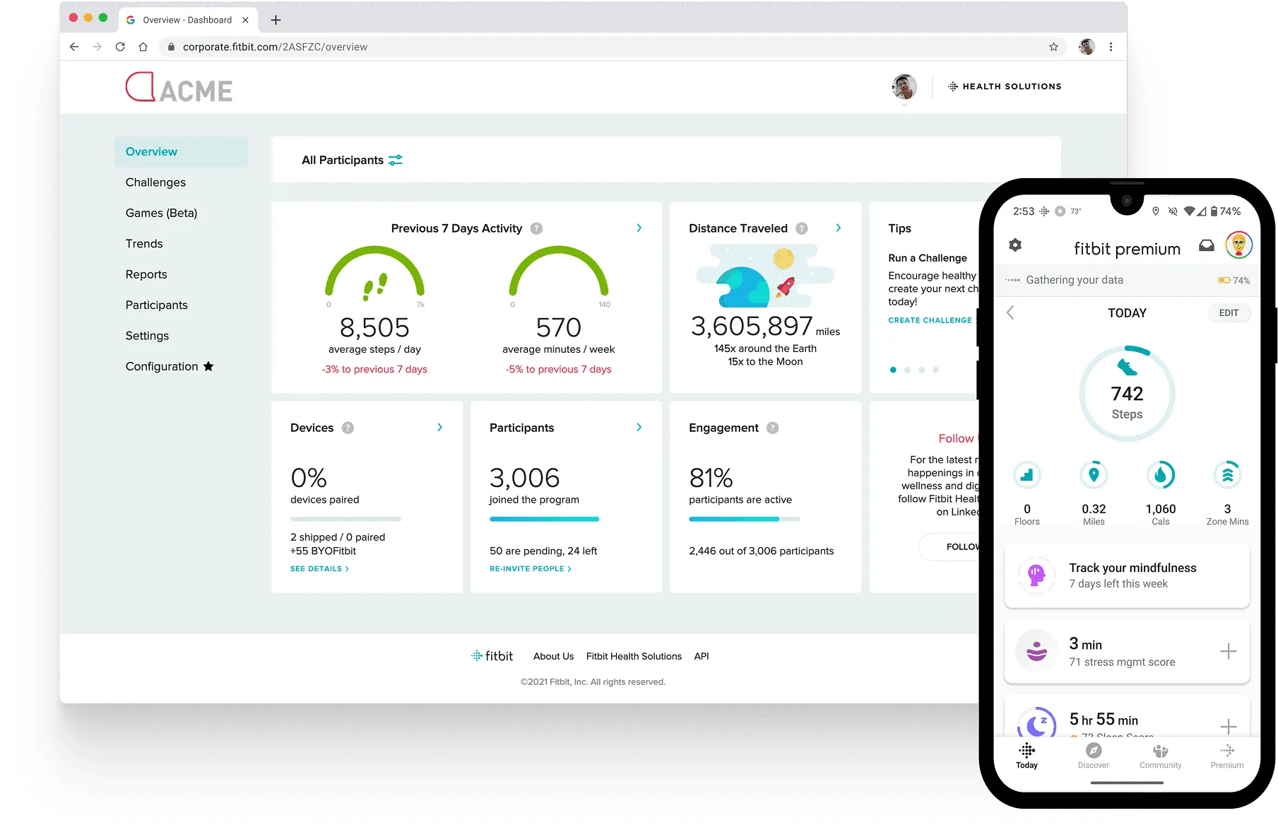
I collaborated with the design team to modernize Fitbit’s design system, aligning it more closely with Material 2.5 and 3. A key focus was ensuring components translated well to web, creating a more consistent cross-platform experience.
Working in a scrappy, fast-paced environment, I helped integrate these components into an older Angular stack while adopting the latest Material updates to balance visual consistency with technical constraints.
Reflections
- This project tested and taught me resilience. Amid company-wide layoffs, shifting org structures, and tight timelines, our team stayed focused—and delivered.
- Though my front-end skills were rusty, working side-by-side with Engineering reaffirmed my belief that tight collaboration leads to polished outcomes.
- Adapting and scaling an existing design language across platforms proved more complex than expected. I partnered with subject matter experts to ensure consistency, but often had to make judgment calls when the system fell short—balancing design fidelity with practical usability on both web and mobile.